

Design is an essential part of our lives, impacting items we are using on a regular basis, from the video games we play to the shoes we wear. However, not all designs are created equal, and understanding the principles of good design is vital to creating a positive user experience. Usability expert Jared Spool has noted that good design should be invisible. By examining examples of both good and bad design examples, we can learn important lessons about what works and what does not. This article will explore three examples of good and bad design, highlighting how good design can improve user experiences.
Principles of good design
In the late 1970s, German industrial designer Dieter Rams introduced his famous book 10 Principles for Good Design, which continues to inspire creators today. Based on Rams' principles, one should consider a list of 10 design principles: inclusivity, stress-free usability, intuitive navigation, problem-solving capabilities, sustainability, friendliness, sensory appeal, altruism, environmental integration, and thoughtfulness.
While many interpretations of good vs bad design may exist, creating a positive first impression is key to attracting and retaining customers. A professional and clever design can set a business apart, establish the foundation for lasting customer relationships, and create a sense of brand consistency.
Good UX design can benefit a business in numerous ways, including increased sales. Here are five examples:
- Professional, sleek designs can help a business stand out and attract consumers.
- A well-designed website can create a positive first impression to help establish lasting customer relationships.
- Easy website navigation can make the customer journey smoother and more enjoyable.
- As demonstrated by Google's recognizable text colors, consistent branding can benefit a business by increasing brand recognition.
- Good design can unlock the full potential of digital products and guide user actions.
Characteristics of Bad Design
In today's highly competitive market, businesses must pay attention to the importance of design. Identifying bad design is just as crucial as recognizing good design. Understanding what constitutes bad design can help designers avoid making the same mistakes and create products that truly stand out. Here are five common characteristics of bad design that can ruin the user experience and negatively impact a business.
- Confusing or cluttered layout: A messy or confusing layout can overwhelm users, making finding the information they need challenging. Thus, messy layouts can result in a frustrating experience and ultimately lead to users leaving the site or app. A practical design should be clean, well-organized, and easy to navigate. A good layout should guide users to the relevant information with clear headings, a logical structure, and clear examples.
- Poor readability or legibility of text: Text that is too small, poorly spaced, or hard to read can be a significant obstacle for users. It can make the design feel unprofessional and may even discourage users from reading important content. A good design uses legible fonts, appropriate font sizes, and sufficient spacing to ensure that text is easy to read, even on small screens.
- Lack of functionality or user-friendliness: A design that is not user-friendly or lacks essential functionality can result in user frustration and reduced engagement. Lack of functionality can include broken links, slow loading times, or confusing navigation. A good design should prioritize user experience, with intuitive navigation, clear calls to action, and fast loading times.
- Unattractive or outdated appearance: A design that looks unattractive or outdated can give users a negative impression of the brand. A bad impression can impact trust or credibility and lead to users abandoning the site or app. The following examples of good layouts are visually appealing, with modern aesthetics and a consistent visual identity.
- Fails to meet user needs or expectations: A design that fails to meet user needs or expectations can lead to dissatisfaction and disappointment. Failing to satisfy users can lead to lost sales, reduced engagement, and damage to the brand's reputation. A design should be user-centered, with a deep understanding of user needs and preferences. It should always be tailored to the specific audience and designed to meet their goals and expectations.
During training at Careerist, we study good and bad solutions, learn to apply the principles of good design, and create awesome design solutions from scratch. Join our UI/UX designer community by enrolling in our training.

Good Design vs. Bad Design: Three Examples
You might be tempted to say good and bad design is a matter of taste, but objectively bad design feels like friction to the user. We have gathered some samples of different design solutions to prove that objectively bad design exists and highlight the importance of following the basic principles of good design (refer to the section above). Here are three examples of bad designs.
Example One: Parking Signs
For decades, parking signs in Los Angeles have been notorious for providing an overwhelming amount of information. The complexity of traffic regulations has made them notoriously difficult to comprehend, forcing the city to convey a significant amount of information in a limited space.
These signs have historically been so hard to understand that they are a commonly referenced example of bad design, as you can see in this photo from the 2010s.

Photo by interaction-design.org. Author/copyright holder: Jorge Gonzalez. Copyright terms and license: CC BY-SA 2.0
While this parking sign is relatively straightforward by LA standards, signs like this are one of the pain points anyone may experience. With this sign, determining whether or not you can park here on a Wednesday morning at 9 a.m. requires significant mental effort.
As designers, we frequently encounter scenarios where we must present a substantial amount of information in a limited space. Although LA's parking signs are extreme examples, many mobile app designers face similar issues and use cultivated wit to make the app work well.
Nilli Sylianteng designed a good alternative sign that combines all the necessary information for drivers to see at a glance.

Photo by interaction-design.org. Author/copyright holder: Nikki Sylianteng. Copyright terms and license: CC BY-NC-SA 4.0
The proposed parking sign has a user-centered approach that meets drivers' simple desire to know if they can park in a given location. This information is effectively communicated through the sign's use of visual cues vs. text in the previous version. Nilli's sign includes green to indicate parking availability and red to indicate no parking. Another aspect that makes this design good is that it accommodates color blindness by incorporating stripes to indicate no parking. Considering user diversity is another best practice. This redesigned sign is a huge improvement because it allows most people to quickly and easily understand parking restrictions.
Example Two: Online Eyewear Marketplace
Coolwinks is one of the examples of eyewear market competitors with clean and well-organized applications. It cannot be simply defined as good or bad. The app could benefit from incorporating more icons instead of images, particularly for the men's and women's eyewear categories.

Photo by uxplanet.org
While the buying experience is straightforward and effortless, there is room for improvement in smart design and development, which could significantly impact the app's overall performance.
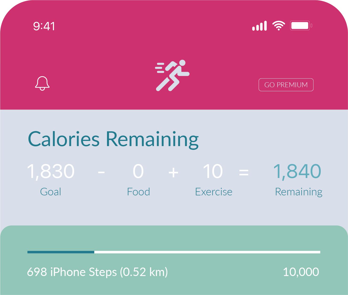
Example Three: MyFitnessPal Calorie Counting System
The design of MyFitnessPal has left an impression on many. This app has effectively tackled the major pain point of calorie counting by providing a secure and convenient way to track calories. The numbers might be difficult to understand initially, but overall it works great for many users.
Additionally, the app offers a diverse range of good pre-programmed recipes and meal plans, eliminating the need to calculate individual calorie labels manually.
Example Four: The Save Button
Adobe provides great examples of good and bad designs for a frequently used "save" button. The bad design does not include a reaction after the user clicks the button. Since most users expect something to happen when they hit a button, the lack of system response could be confusing. The good design, on the other hand, displays a small animation to confirm the action.

Source: xd.adobe.com
Example Five: Button Information
It is essential to keep buttons concise. Large buttons will likely be interpreted as a text block or an ad rather than a call-to-action.

Source: xd.adobe.com
Example Six: Pop-Up Boxes
These boxes are meant to explain concepts, call to action, or confirm a certain action. In the bad example, the box does not give the option to close the window, and the "Cancel/Create" buttons are too small to create a call to action. The good example has solved these two issues.

Source: xd.adobe.com
Example Seven: The Drop-down Menu
Any drop-down menu should have a description. Otherwise, it is a bold list of random words and hard to limit to a specific one. Even the most confident client will hesitate when picking one.

Source: xd.adobe.com
Example Eight: The Fill-In Form
A standard form might be tricky to fill out when something goes wrong. A good solution is to highlight the field with an issue so the user can correct or edit the line quickly. Imagine yourself confronted with these two forms and pick the one that would be easier to correct.

Source: xd.adobe.com
Example Nine: Confusing Layout in Printed Media
You may be curious about what is wrong with this ad. Since this ad is in a print magazine, the social media and delivery app icons are useless! It would work much better if there were a QR code to scan. In this case, the ad fails both in user-friendliness and marketing terms: too much information and no highlights to encourage a potential customer to use their service.

Source: sitebuilderreport.com
Example Ten: The Door with a Big Handle
We have all encountered this door. What are the chances of pushing on the right side? While your chances are technically 50/50, they sometimes feel worse than that. These doors require a sign indicating which side of the door opens, especially if you need to enter or exit quickly.

Source: sitebuilderreport.com
Conclusion
A good, user-friendly design is intuitive, easy to use, and aesthetically pleasing. It allows users to interact with a product or service naturally and effortlessly. On the other hand, bad designs prevent us from making the most of a product. User-friendly designs can save time, reduce frustration, and increase user satisfaction by giving the feeling that the bottle is full. Apply for Careerist training to dive deep into what makes good and bad designs. Designs created with the support of professionals are learned best.

Related Articles
20 SKILLS REQUIRED FOR UI/UX DESIGNERS
WHAT IS THE ROLE OF A UX DESIGNER? RESPONSIBILITIES & SKILLS
UX DESIGN: IS THERE POTENTIAL IN THIS INDUSTRY, AND WHAT CAN PROFESSIONALS EXPECT?
HOW TO GET STARTED WITH A CAREER IN UX DESIGN